School of design
Carnegie Mellon University’s Design School taught me all of the basics of design. This is a sampling of work I produced during my years in school.

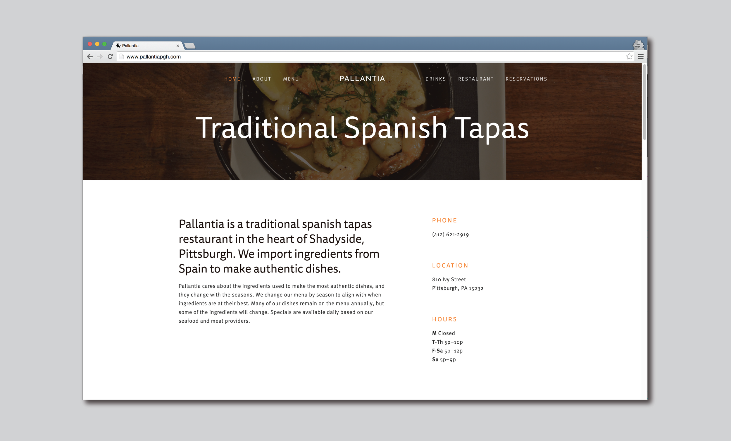

Pallantia
Branding • Systems Design • Web Design
Pallantia was an upcoming Spanish tapas restaurant that featured traditional Spanish dishes with a modern style. Opening on a street adjacent to a plethora of businesses in Pittsburgh, Pallantia needed to give a strong presence within the community. I developed a brand for this new restaurant of boldness, strength and traditional style. Spain is known for bulls, delicious food, beautiful architecture and the color red. These are the aspects of Spain I strived to capture for Pallantia.
Deliverables included a workmark, logo, exterior signage, menus, website and advertisement layouts. This was one of my first experiences developing a full branding system and grew it as the restaurant grew.
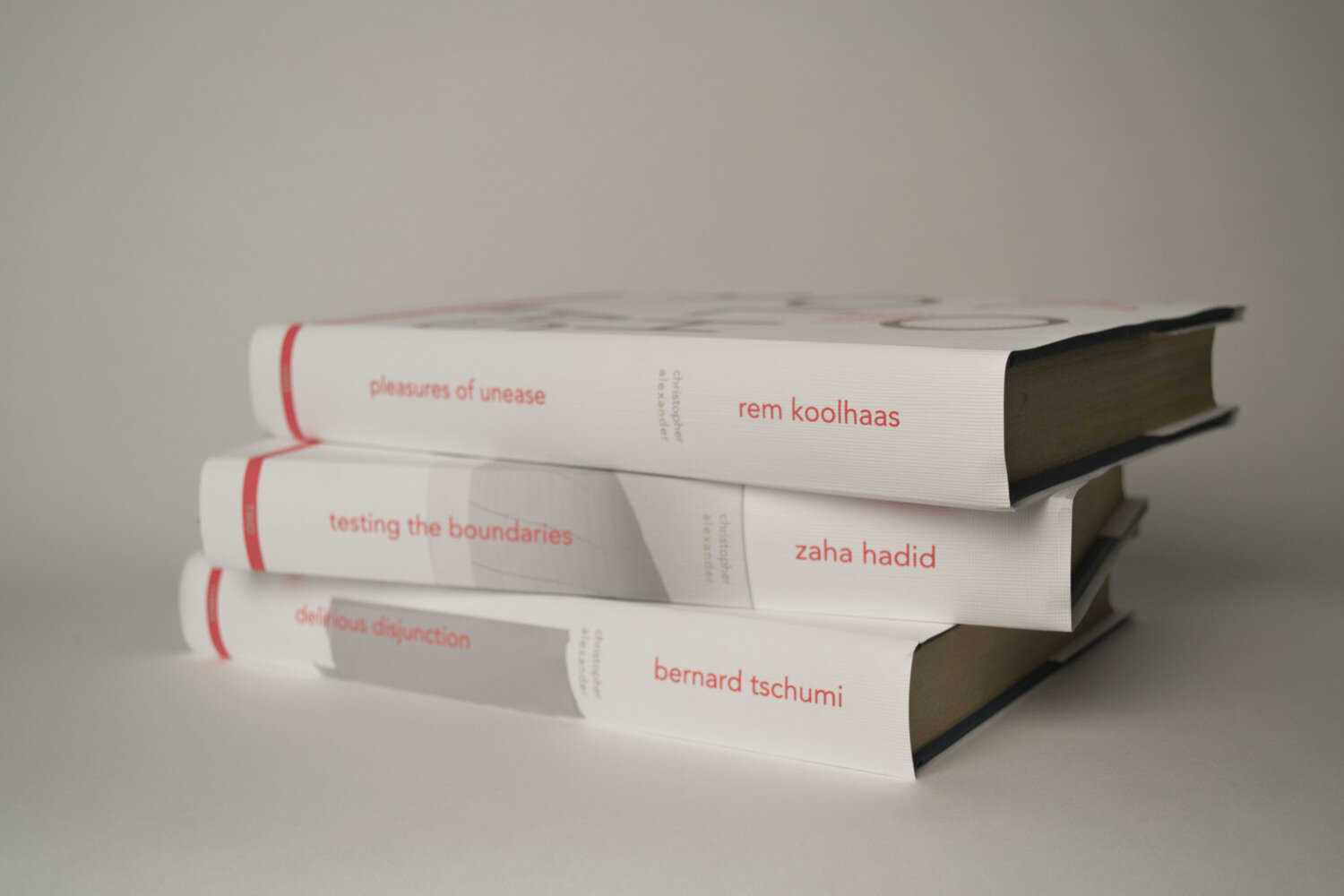
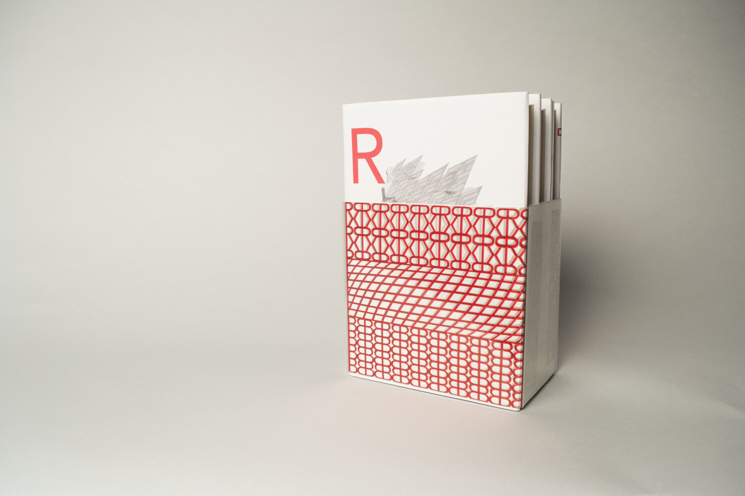

Book covers
Print • Visual Design
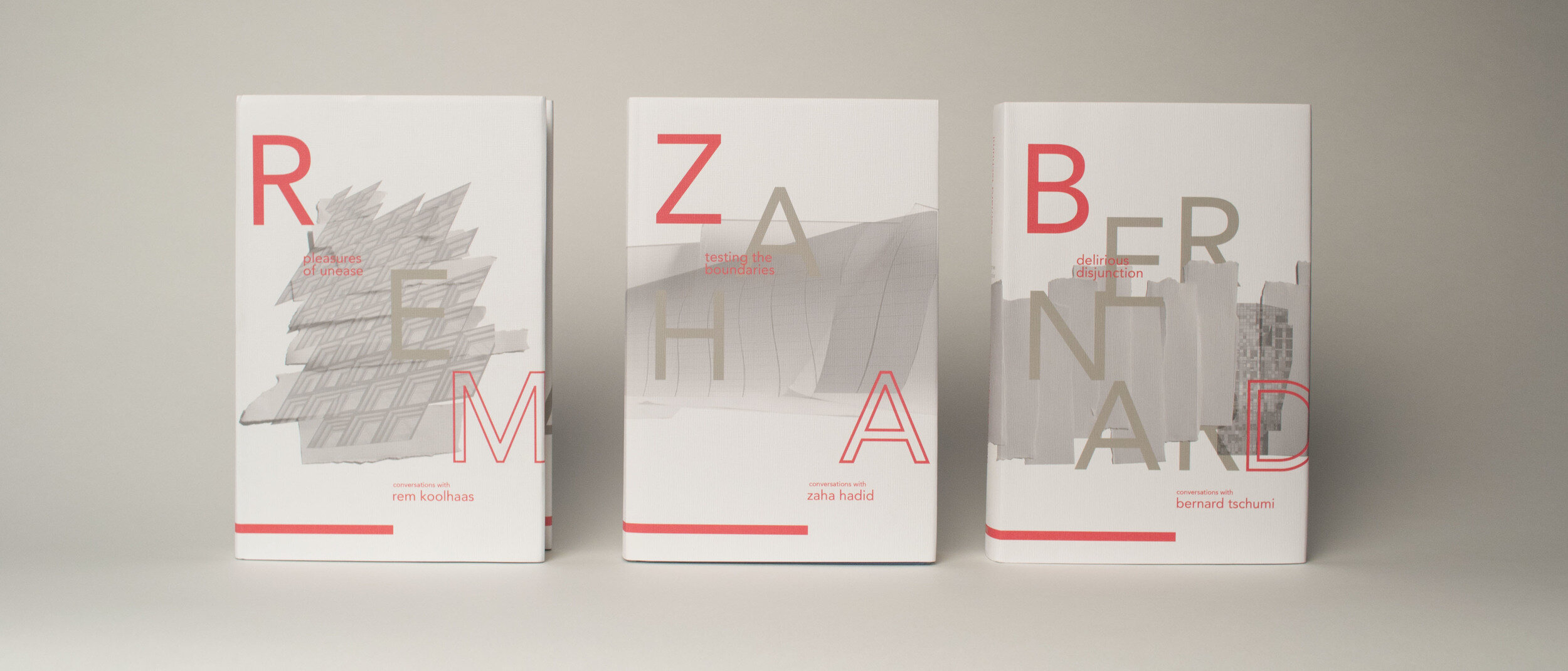
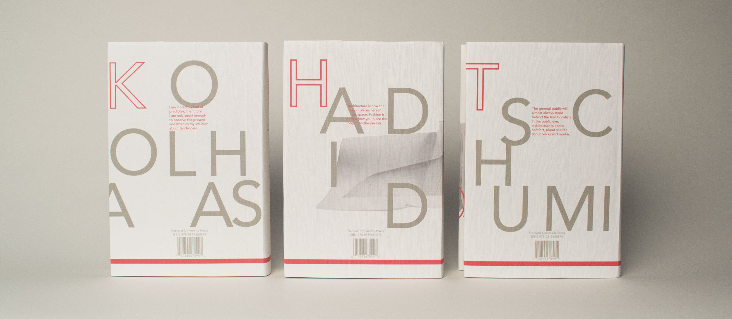
I developed three book covers based on three modern architects, Rem Koolhaus, Zaha Hadid and Bernard Tschumi. After extensive research on all three architects I established that there was a commonality between all of their unique styles. Their buildings create a unique layer within the cities their buildings reside in. The theme that connects all three books together is layering. I established a color pallet, photographic style and typographic settings that are consistent throughout the books. Each book communicates the work of the architect but all fall within the same conversation.
Design revolves around iteration. A final product is never achieved without trial and error. After research about each architect and learning about the style of architecture they share, I began to visualize what each individual had in connection to the other. Layers of information, complexity and form attain are the commonality that brought all three together. This collection of books needed to live within each other, similar to how they live within the environments these unique buildings are developed in. The break of pattern in a common city is what inspired the visuals for the covers and the bellyband.

dear pittsburgh
Design for Social Justice • Brand System • Website Desigm
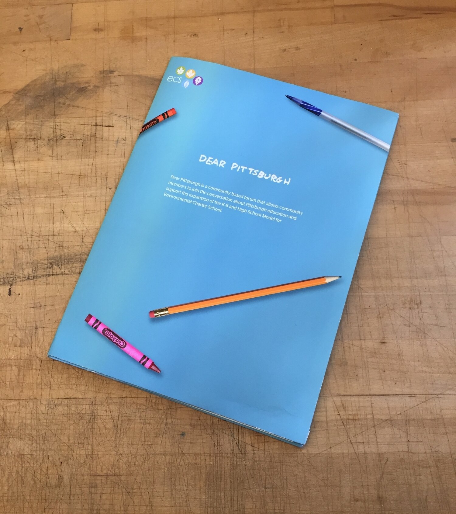
Dear Pittsburgh is a grassroots campaign for the Environmental Charter School in Pittsburgh that works to gain support from community and school board members for the expansion of the school. The school prides itself on its different way of teaching students and believes that students who are lucky enough to learn at ECS should continue their studies in High School. My partner Robyn Lambert and I worked together to develop the campaign. Through a digital experience and a physical experience, the school provides community members with a variety of ways to support to school. The main goal of Dear Pittsburgh is to collect personal letters from parents, students and community members conveying the ultimate learning experience and how ECS provides students with the skills to become active and engaged citizens.
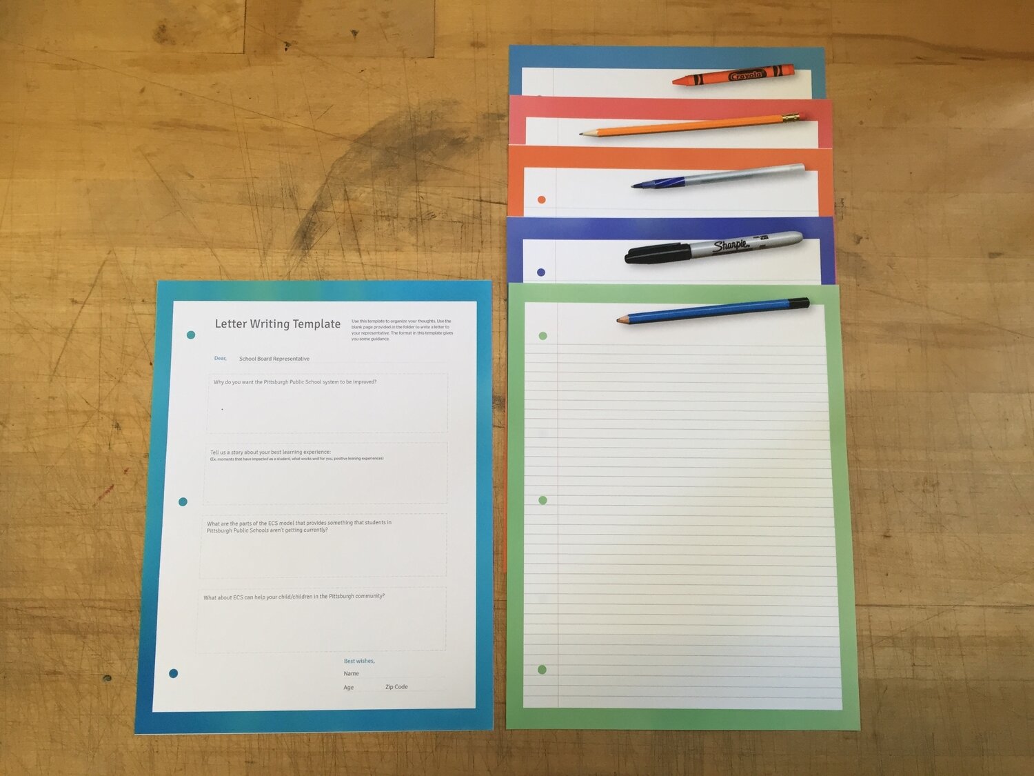
To supplement the website, we also created a letter writing kit that community members can use to write physical letters to their educational representatives. This kit includes a blank letter page, a template sheet, envelope, and a sheet to find your school representative and an explanation about the campaign and the ECS school model. These letters would be able to give a more personal touch to the letter writing campaign and could feel more genuine. The folder is formatted to align with the online visual style of Dear Pittsburgh so all school representatives will know when they receive a letter from a community member about ECS.

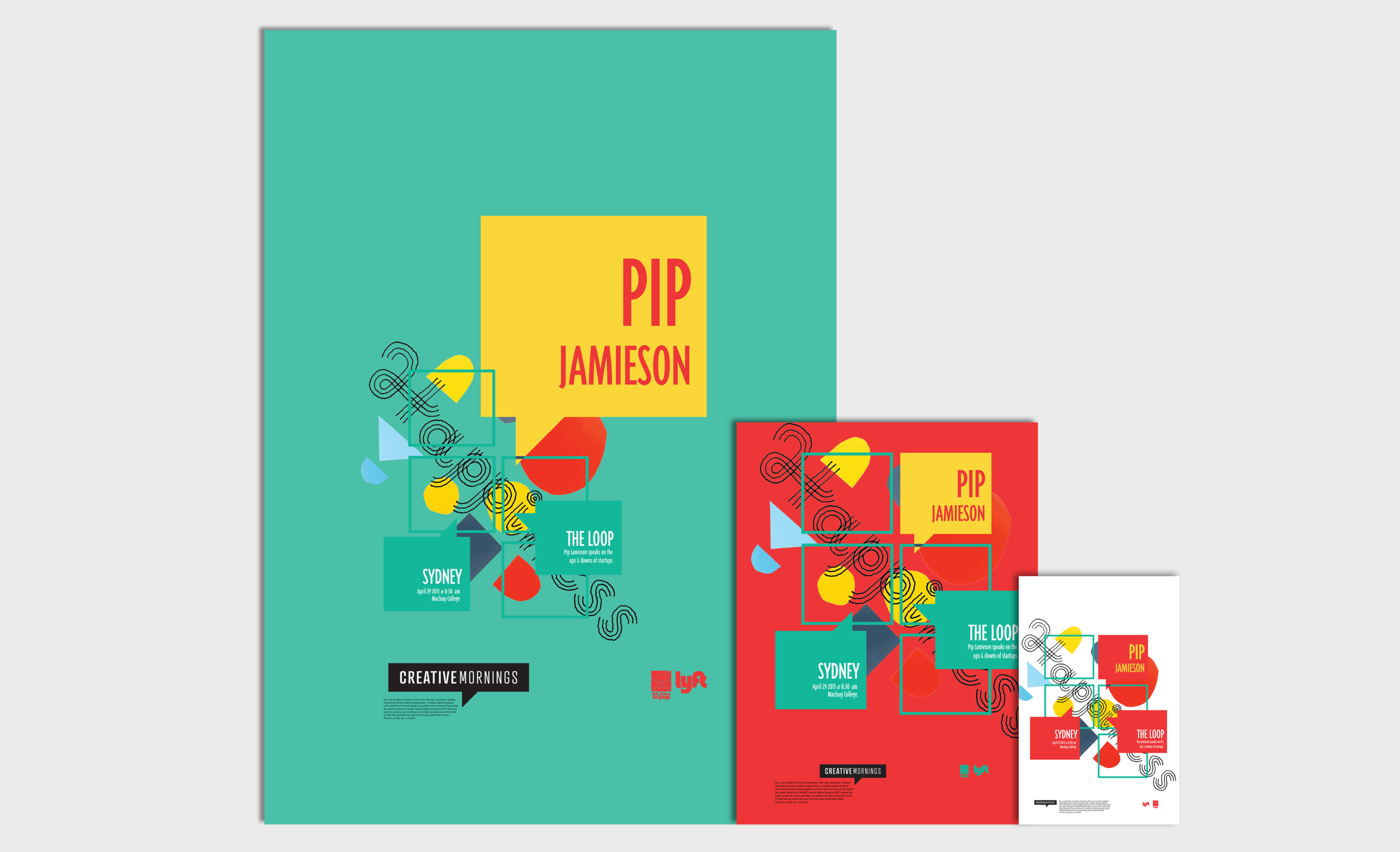
creative mornings poster series
Visual Design • Brand System
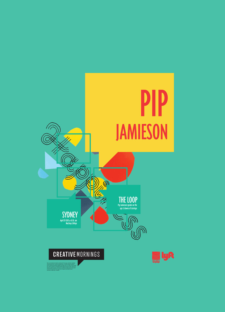
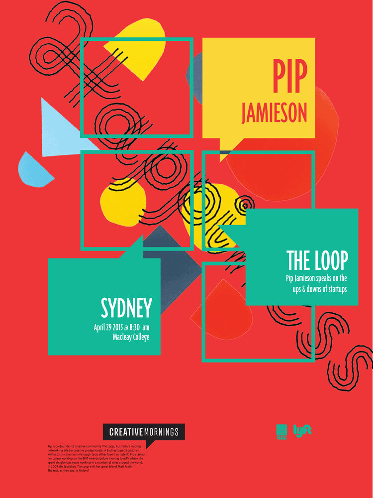
Creative Mornings is a lecture series geared towards creative and experienced thinkers. The series presents monthly topics with interesting speakers throughout the world. For my project, I developed a visual system on posters and web banners to promote the series and the speaker. The system introduces the color of each city with a complimentary color and third expressive color. Background images contain artwork presented for each Creative Mornings theme by other artists with layered geometric shapes and Creative Mornings speech bubbles. This visual system is used for promotion, information and to spread the word of how great the series is. This system is meant to be used across all themes, locations and speakers.
This entire system was developed in a week. The visual system of the posters and web banners are consistent throughout each piece. The project began with a three hour design challenge. We were given the dimensions, topic of Creative Mornings and elements to include. The system was meant to be used across all lectures and themes. Ready, set go! Presented here is my three first drafts. I chose the topic of Happiness with the lecture by Pip Jamieson on the ups and downs of start ups. Clearly rough, fun and colorful sketches that I used to get my first ideas out there. I also produced two web banners with the same attitude as the first three. I even attempted a new speaker and topic to see how my proposed system would change.
This for That
Print • Visual Design • Design for Teaching
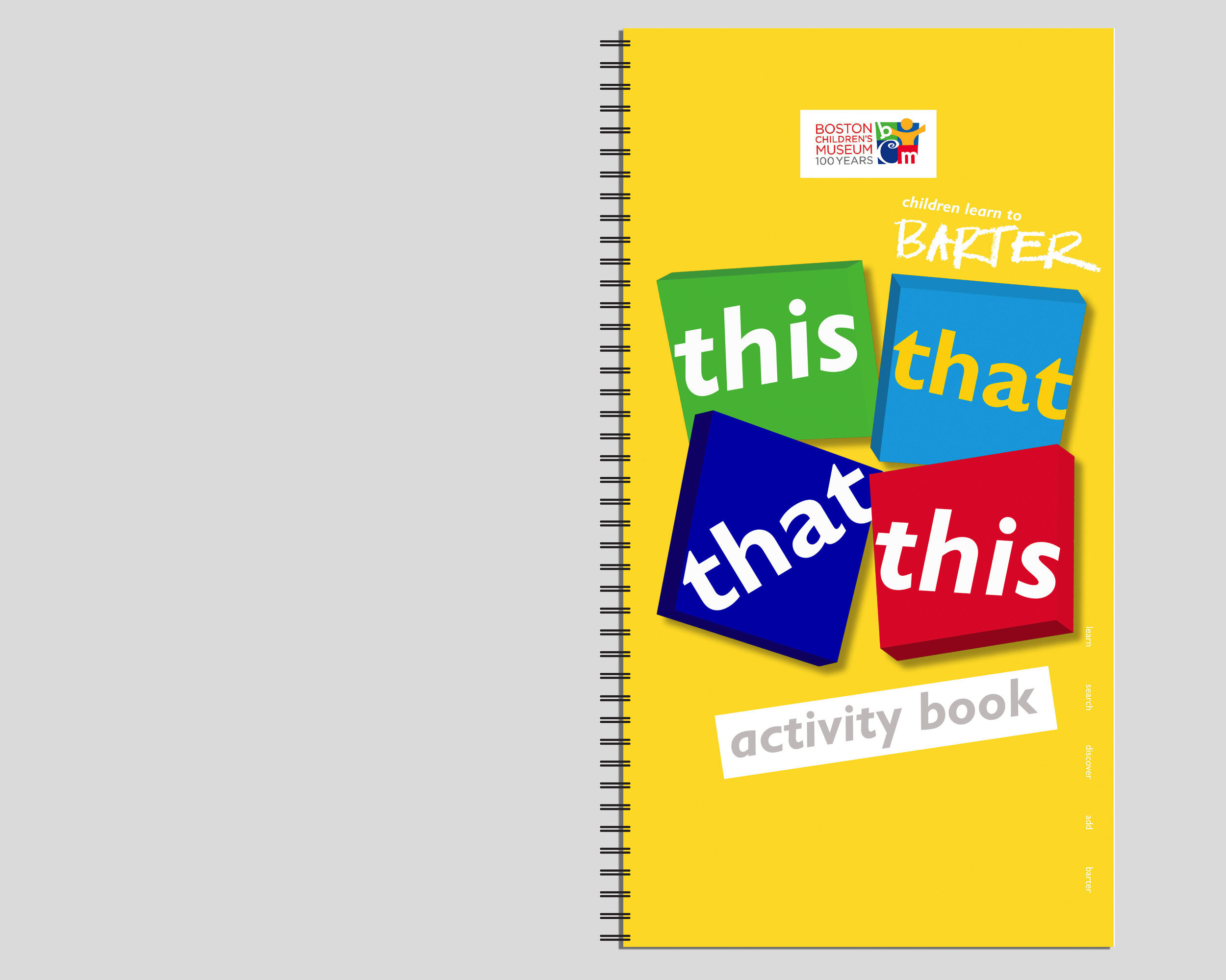
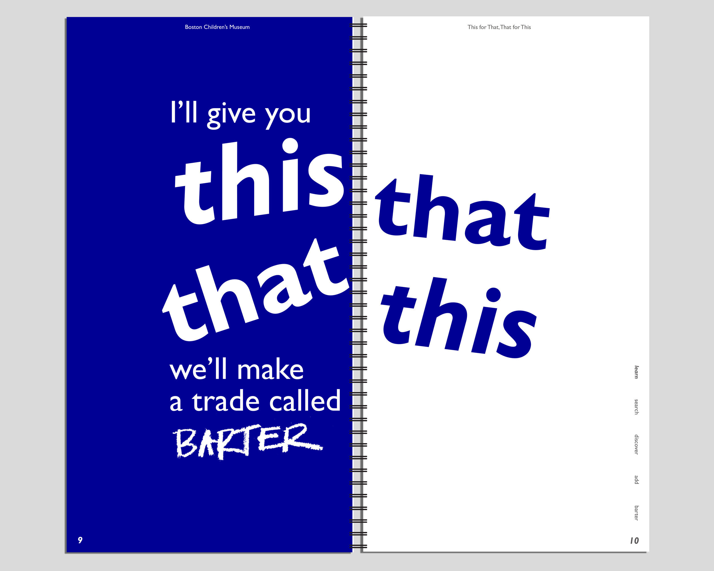
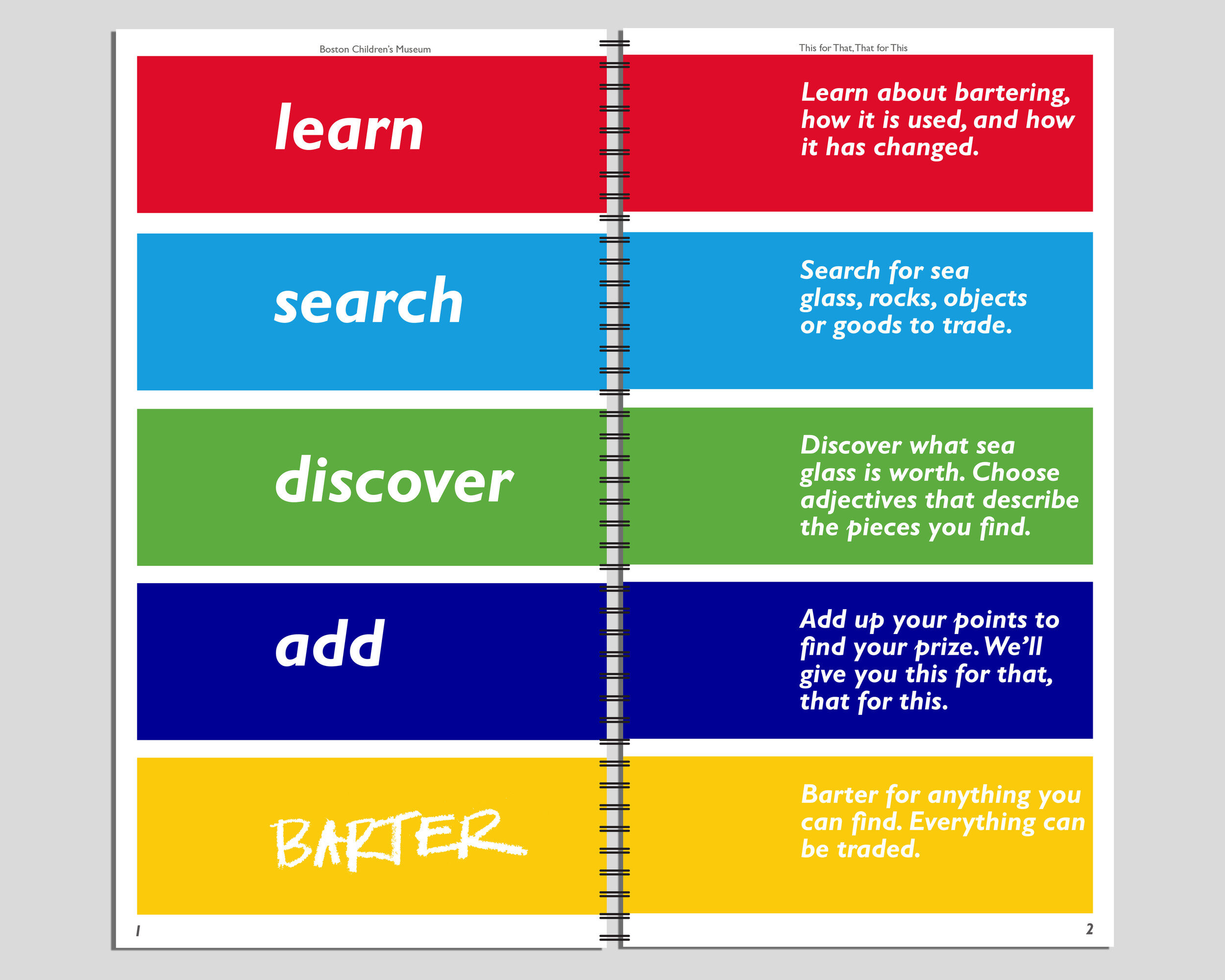
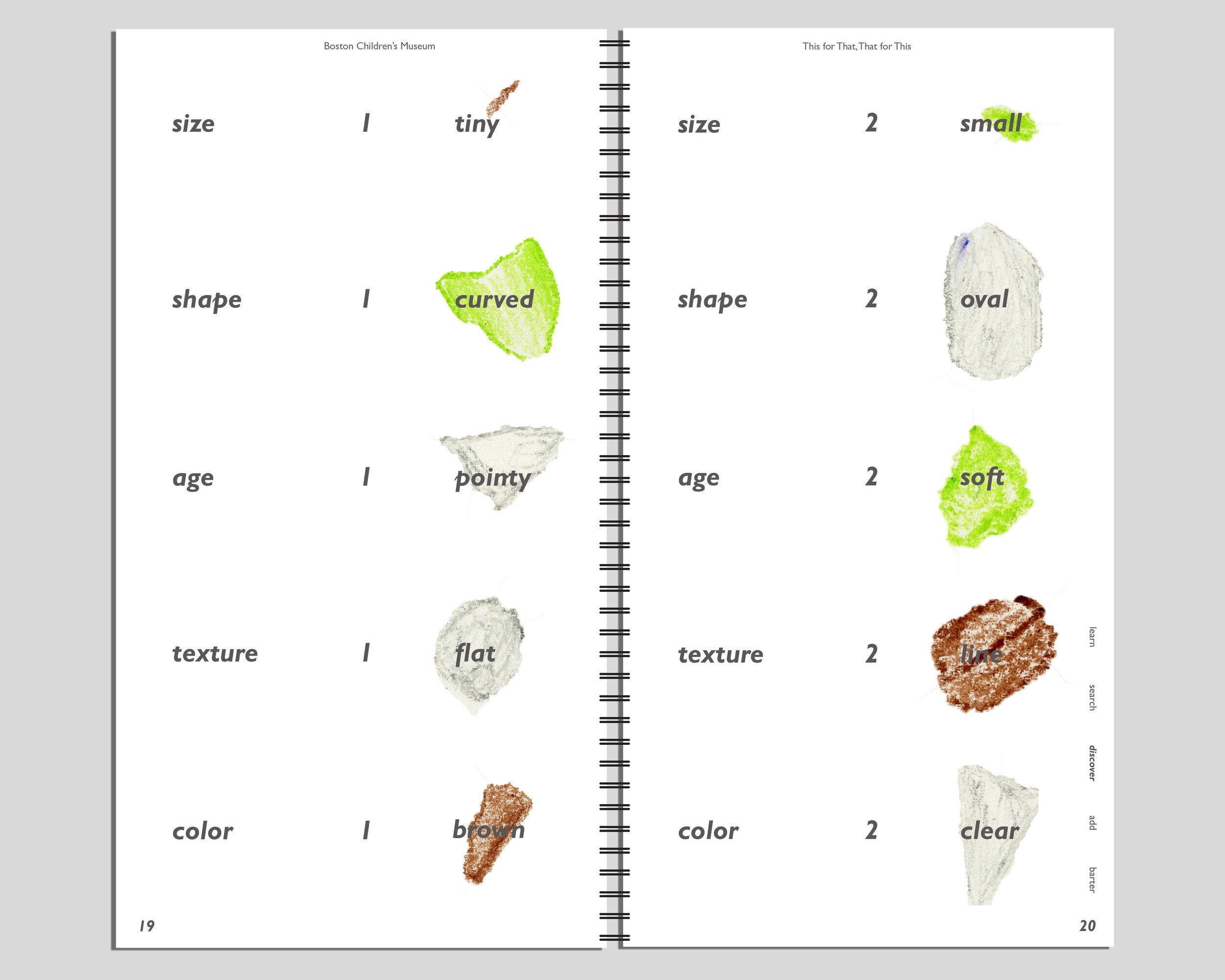
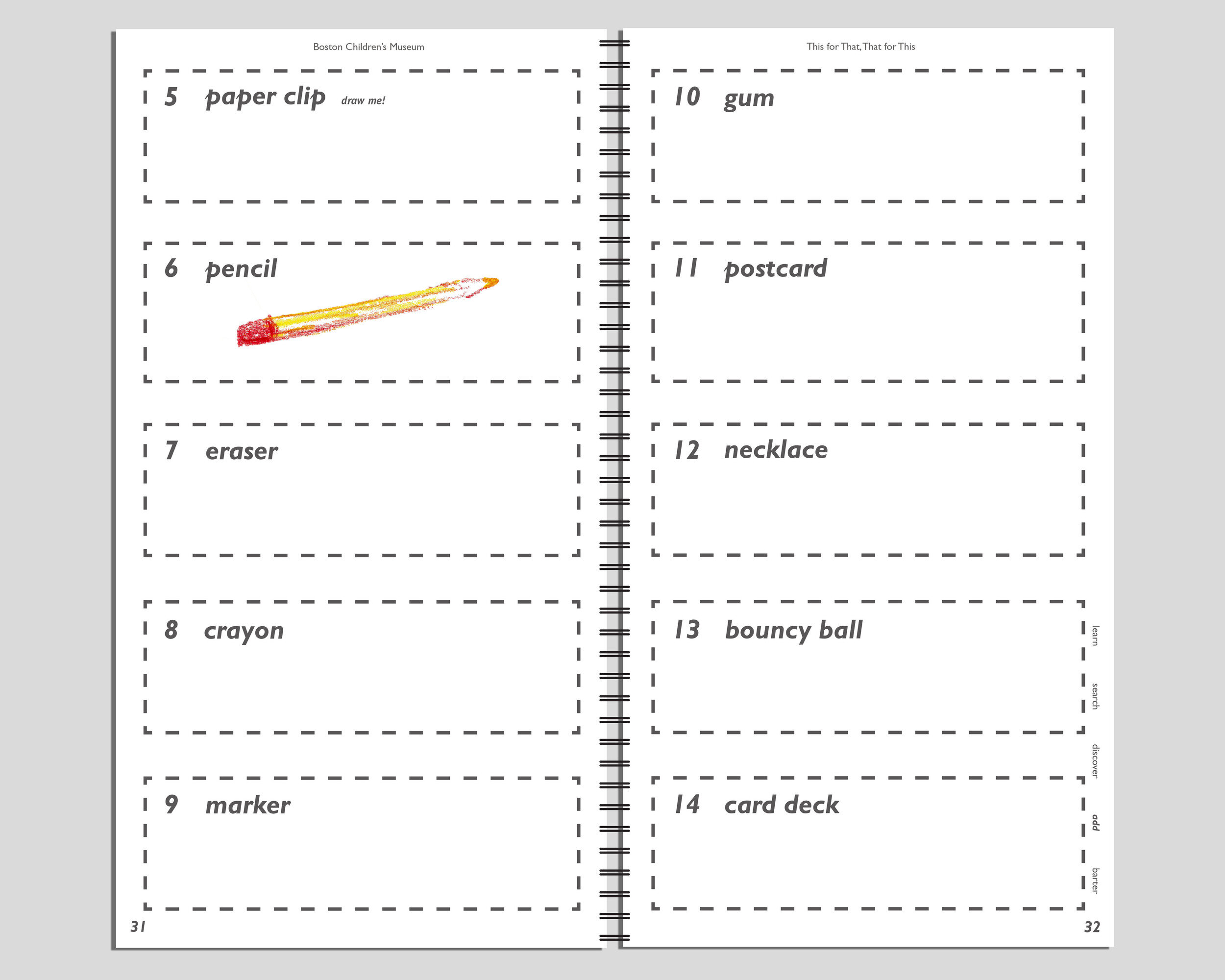
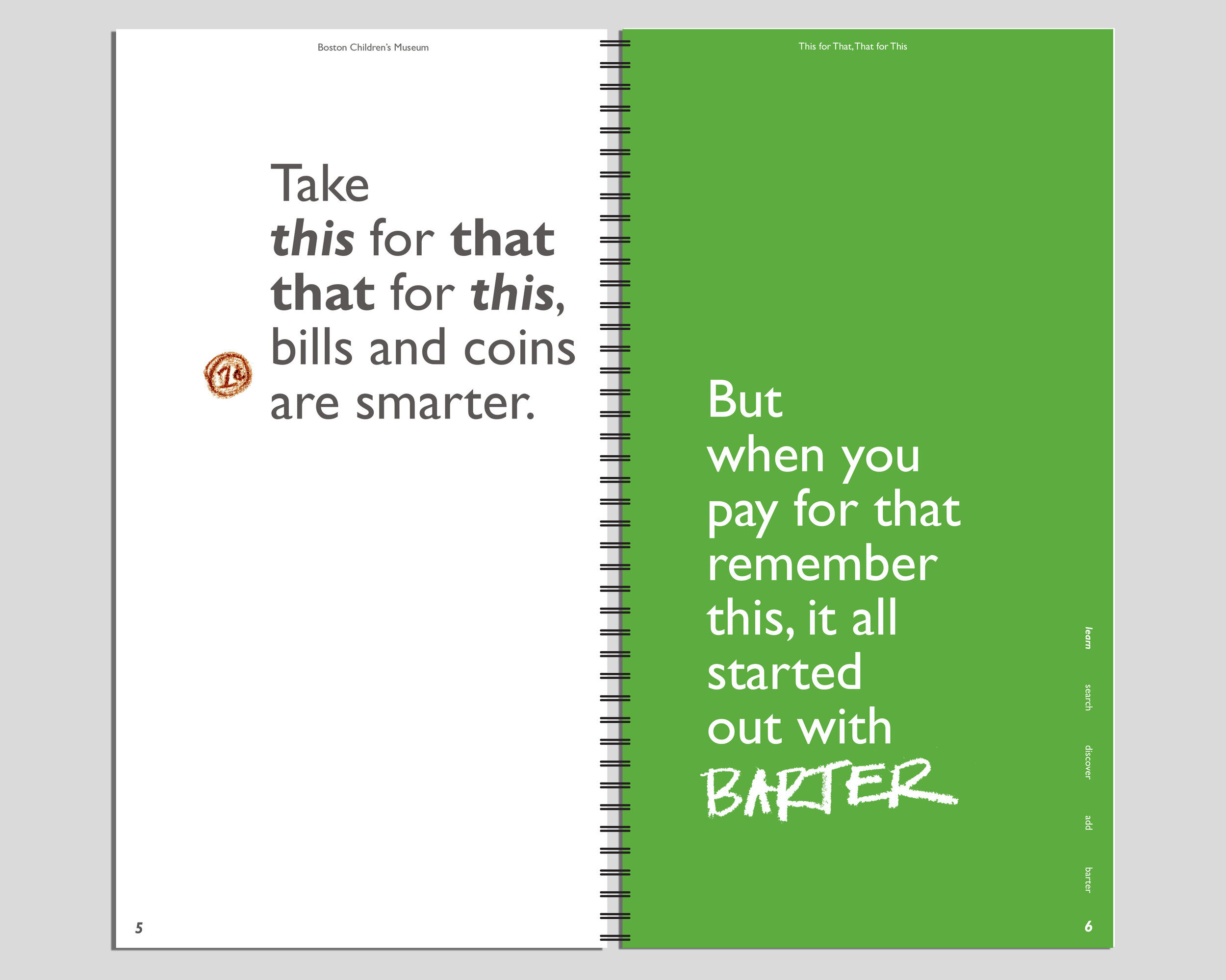
This for That, That for This is an exhibit ideally hosted at the Boston Children's Museum featuring an interactive learning experience that teaches children how to barter. The idea is based upon the idea that children do not understand how much money is actually worth. Giving them the opportunity to start to learn how much things are worth is a rewarding experience. Through my personal collection of sea glass, children use each piece to analyze and figure out how much each sea glass is worth in comparison to another object. With the explanations taken by School House Rock the Bartering song, it is displayed in a booklet with pages to write and draw on.
This project has a very personal connection to my life. Based on my personal collection of sea glass, I was raised by a mother that grew up at the beach and taught me to train my eye to find every piece of sea glass. When she was young her babysitter created a system that gave worth to each piece of sea glass she found and received a reward to trade. Learning from physical things gives an immediate connection to children that they will remember forever. The goal for this project was to communicate these ideas through exploration and independent learning.